Car-Buying App Registration
The Challenge
Write a multi-screen registration experience for a car-buying app that lets users view discounted prices. The app also enables dealers to call and email the user so they'll visit the dealership to buy a car.
Registering a new account can be a major-turnoff. If the process is too time-consuming, the user will bail and find a competitor. To prevent this, my UX text has to (1) convince the user that it’s worth signing up, and (2) make the sign-up experience as easy as possible.
My Solution
My text makes it clear what the user gets from signing up:
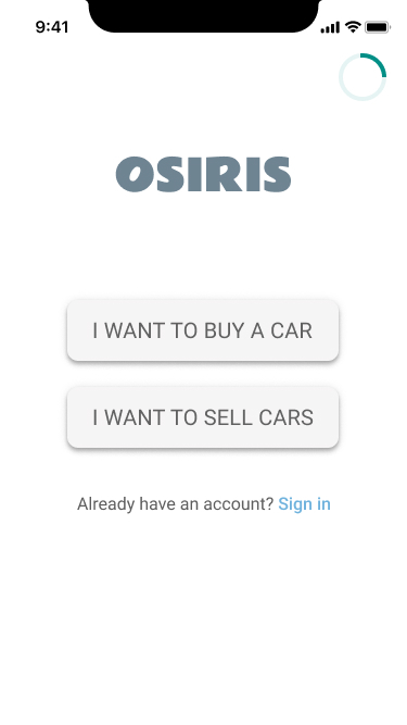
- Under the brand name (Osiris) is a brief description of the perks of signing up. They’ll get an abundance of choice. They’ll also be able to access discounts. I also establish Osiris’s reputation as South Africa’s largest car marketplace.
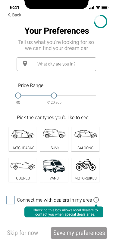
- The preferences page tells the user why this step will be worth it (to help the app find the perfect car for them).
My text makes sign-up quick and painless.
- The text supports the design. It’s simple and stripped-down to keep the user undistracted so they complete the whole sign-up process.
- To save time, the form only requires 3 piece of information. Agreeing to terms and conditions is not a separate option. The user can also choose to sign up using socials which can make the process easier. Inputting preferences can be skipped.
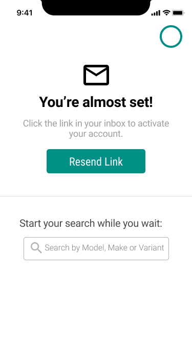
- The user can also start using the app (with limited functionality) before their account has been confirmed.