Pick n Pay App Redesign
Project brief:
Pick n Pay’s Smart Shopper app is notoriously dysfunctional.
The problem is mostly functionality, which is out of the control of the UX designer. Still I thought I’d take a shot at polishing their Discounts feature.
This feature generates personalized discounts for the user. The user then selects and loads their discounts to their Smart Shopper card. If the user does not make use of the discount before its expiry date, it disappears.
Problems with the original:
-
Loading to the card is an unnecessary step. The app is a bit rocky, and so sessions often time out before the item is properly loaded. This is a major source of frustration for the user.
-
It’s difficult to find the right product in store. Partly this is because the labels on the app are difficult to read quickly. Many a time I have bought a bag of kale, only to find the discount was for chopped kale, not loose leaf.
-
Though the discounts are allegedly personalized, there’s no option for user input into the choices the app gives them. I’ve been a vegetarian for three years, yet I’m regularly recommended deli meat or lamb. This risks being insensitive to users with dietary restrictions, sometimes for religious reasons.
Redesign - solutions:
-
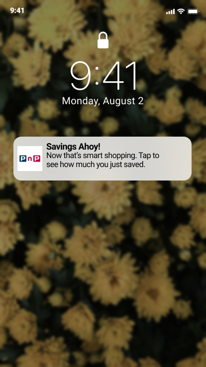
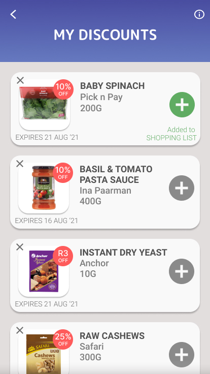
Discounts load automatically to the card, no user input needed. The user can add to their shopping list (an existing app feature). One potential downside of this is that the user doesn’t feel “the win” they get when they load the discount. As an alternative reward, a notification pops up after a purchase on the card. It allows the user to see how much they’ve saved, generating a sense of satisfaction.
-
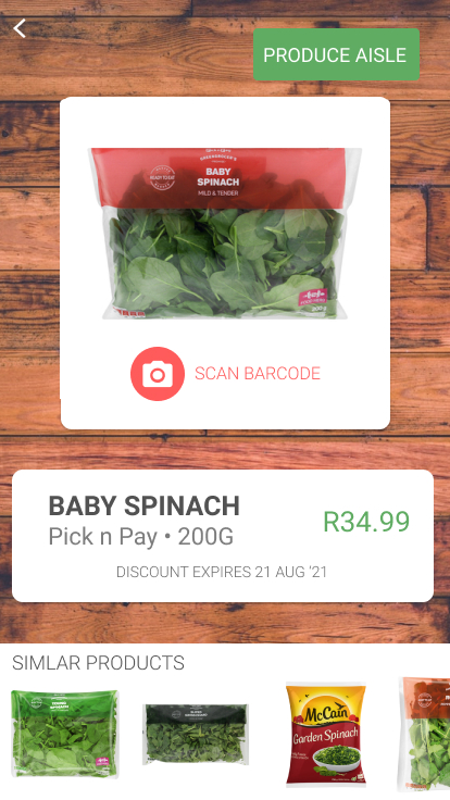
The product descriptions are clearer. A hierarchy of information (Product / Brand / Weight) makes it easier to find the right product. Clicking on the product also gives a more detailed view of the product, including the aisle in which it’s found. There’s also a barcode scanner option: users can scan in-store items to make sure it matches the discounted item. This product page also shows users similar products. This makes it easier to compare product prices and decide whether the discount is worth it or not.
-
The user can teach the app. They have the option to dismiss a product and/or request not to see the product again. In future, there would also be a preferences tab where the user could deselect products like dairy or meats they don’t want suggested to them.